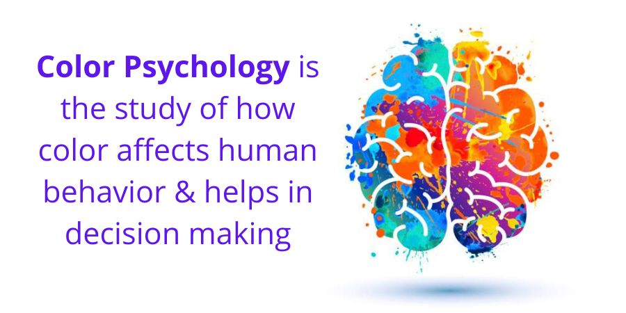
You probably already understand that different colors can evoke various emotions and meanings, even if you haven’t done any research on the subject of color psychology.
Your favorite colors are frequently the inspiration for how you beautify your home, what you wear, what you drive, and even what foods you find most appealing.
In branding, marketing, and web design, color selection is important. In fact, up to 85% of people’s purchasing decisions can be attributed to color. Within just 90 seconds, color has the ability to enhance or decrease brand trust, boost or diminish customer loyalty, and shape 90% of a customer’s view of a brand.
Therefore it should come as no surprise that your web design company will ask about your choices for website color as soon as you decide to carry out a comprehensive either your first website or a revamp of an outdated one.
Read through our suggestions for making wise web design decisions including website color schemes based on the psychology of color.
Consider the meanings associated with each color
You may already be aware of the significance attached to the most common colors. When you need to de-stress, you might be attracted to the color blue, whereas the color orange might not seem proper for official business documents.
Some of these qualities can help to explain why some colors are more preferred in particular sectors of the economy. For instance, banks frequently use the color blue, while trying to date service brands are advised to use the color red.
While reading articles about stress relief on a website that is bright yellow, a customer might get the impression that something is off, even if they are unable to articulate it.
Take into account these typical connotations that various colors have. Which ones have you already picked up on?
Read: Comprehensive Handbook of Website Design
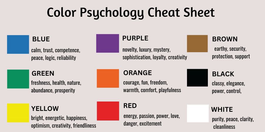
Blue
Using Blue Blue on a food-related website might turn off visitors because it naturally stifles appetite. Many people believe that this is because there aren’t many common foods that are blue.
However, outside the food industry, both men and women prefer the color blue more than any other. Because so many people are drawn to it innately, companies frequently use this color to reassure or instill trust.
Yellow
Although yellow is cheerful and playful, you must keep in mind that it’s also used for signs.
When it is used sparingly, this energizing color can increase visitors’ excitement while, when employed in greater quantities, it quickly becomes abrasive and overpowering. Yellow can be used as an accessory to draw attention to a particular call to action.
Green
Green has such significant connections with the natural world and being eco-friendly that the color itself can suggest an organization’s ethics.
Green is also becoming more and more common because it combines the calming effects of blue with the energizing qualities of yellow.
This is a choice that is becoming more and more well-liked across a range of industries because it is also frequently associated with money and growth.
Orange
Although orange is the new black and red, it can be difficult to work with. Even though it’s a kid favorite, most adults have a love/hate relationship with it. So it’s important to smartly incorporate it into your website if it’s intended for adult customers.
Orange can play a significant role in defining your brand’s personality and motivating website visitors to take action because it is closely connected to energy, excitement, optimism, and warmth.
White
The significance of the color white in web design may be better understood if you’ve ever heard the term “white space.” The freedom that white conveys gives your site visitors the visual space to breathe they need to take in the information you are presenting.
But white also has a significant disadvantage: It can be hard on the eyes and appear chilly, stark, or unappealing when true white (#ffff) is combined with true black (#000000).
Utilization of an off-white, such as ivory, which has the same advantages as white but a relatively warm tone that is more reassuring, is an insightful solution.
Black
Black is undoubtedly one of the most popular colors, but you should use caution when using it because of its many contradictory connotations.
For instance, it is formal and also conventional; edgy but also corporate. Black can provide a grounding impact when used sparsely, but when utilized excessively, it can easily take over your entire design.
The good news is that black and white both have a wide range of tones, making it possible to achieve the same effects with less disadvantage by using darker undertones and softer tints.
Red
Red can represent power, aggression, or even anger, but it is typically linked to romance, passion, and drama. It is advised to take it in moderation as a result.
Many web designers contend that it’s the best option for buttons as well as other calls to action because it so strongly encourages action.
Don’t feel like this is your only option because research doesn’t always back up this assertion. In a prior blog post, we went into great detail about our strategy for creating convincing calls to action.
Pink
Pink is frequently used to denote femininity and softness and has significant connections with gender. Lighter shades can make it appear delicate and frail, like a flower, while darker shades can make it appear euphoric or voluble.
Pink also represents love, but it does so with a softer, more private kind of love as opposed to the fiery passion we relate with red. Both confectionery and baby products benefit from this soft texture.
Read: Benefits of UX design for your business
Purple
Similar to orange, purple can engender strong feelings of either attraction or repulsion in customers. Purple has a regal air of luxury because it combines the strength of red with the steadiness of blue.
Purple can also represent wisdom, creativity, and mystery. It’s not suggested for every industry, but for a few, it might be the best option.
Brown
The least used color in web design is brown. It is disliked by both men and women, and it can be challenging to combine it harmoniously with other hues.
Dependability and toughness are its favorable connotations, but it tends to take a keen eye for design to keep it from having to look drab and dark.
Blush, a very particular shade of nude pink that borders on beige, has grown in popularity as a contemporary substitute for both pink and brown over the past few years.
Businesses that cater to women, particularly women in their 20s and 30s, frequently use blush as an indifferent with more feminine undercurrents in place of tan or beige.
Consider which colors are recommended for your industry
While it’s unlikely that your company’s goal is to totally mix in with the competition, there are some colors that are just better suited to certain industry sectors (and other colors that can send your users running away). Be it web design services for small business or big, these work everytime.
Blue: Health, science, utilities, the government, the healthcare industry, employment, law, information technology, and businesses.
Green: Industries include those in healthcare, science, government, employment, ecotourism, and human resources.
Black: Mostly appropriate in the following industries: building, business, finance, oil, cosmetics, mining, fashion, and trades.
Grey: These colors are appropriate for the following industries like automotive, journalism, sportswear, technology.
Red: These for fashion, makeup, food, dating, video games, retail, automotive, hardware, video streaming.
Orange: Orange goes well for industries like drinks, retail, fitness.
Yellow: Coming to yellow, it is perfect for automotive, retail, food, technology, construction industries.
Pink: Pink suits Medical (pediatrics, OB/GYN), food, cosmetics, retail industries.
Target Customers and their preferences should be given first priority
Are you aware that there have been fairly extensive studies done on this very topic by experts of winning web design services for small business and big corporations?
Step one also included a little information about color preferences all over genders. It goes beyond the simple statement that “men don’t like purple” Genuinely, there’s a tonne of fascinating data on gender and color preferences:
The most popular color in the world is blue, which is cited as such by 57% of men and 35% of women.
Blue (57%) green (14%), black (9%), and red (7%) are the preferred hues of men. Orange, yellow, brown, grey, or white were only mentioned as favorites by less than 5% of men, and neither orange nor purple were mentioned.
The top five colors preferred by women are blue (35%) followed by purple (23%), green (14%), red (9%), and black (6%). Orange, yellow, brown, grey, or white were only mentioned as favorites by less than 5% of women.
In the end, two websites with blue and white as their primary colors may appear and behave entirely differently.
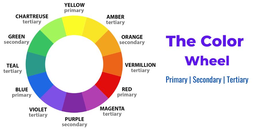
Color psychology involves more than just choosing the one color you want to use to represent your brand; it also takes into account things like color schemes, white space, and the strategically placed use of specific colors, which can create a wide range of variations even with the use of just one main color.
Every website should, in the opinion of many web designers, have a background color, a base color, and an accent color.
The 60-30-10 rule, which states to use one color 60% of the time (as the dominant), some other 30% of the time (as a secondary), and the third 10% of the time, is yet another popular recommendation.
A Few Things to Take Heed Of!
It is obvious that color psychology involves more than just gravitating toward your personal favorite colors. As you proceed to market to your potential customers, it can be helpful even just to use color psychology to better comprehend them.
If you’re feeling daunted by the variety of choices, keep the following in mind:
Remember that each person’s perception of color is unique. Although there are general trends in how people perceive color, so much of it is influenced by individual experiences.
The mere fact that statistics suggest one set of colors for your target audience does not imply that this is the best option.
Eventually, not everything comes down to the particular colors you pick. While different populations have preferred colors and colors do have different meanings, the most crucial aspect is how a user associates a color with your brand.
Customers may be turned off by your color choice just as much as by their least favorite hues if it makes them feel completely unrelated to your brand.
Summary
Color is powerful. It affects people’s thoughts, feelings, and actions. Your brand will be strengthened, sales will increase, and visitors will even be directed to particular web pages or calls to action. Check out this article to learn how to use color psychology for website design.